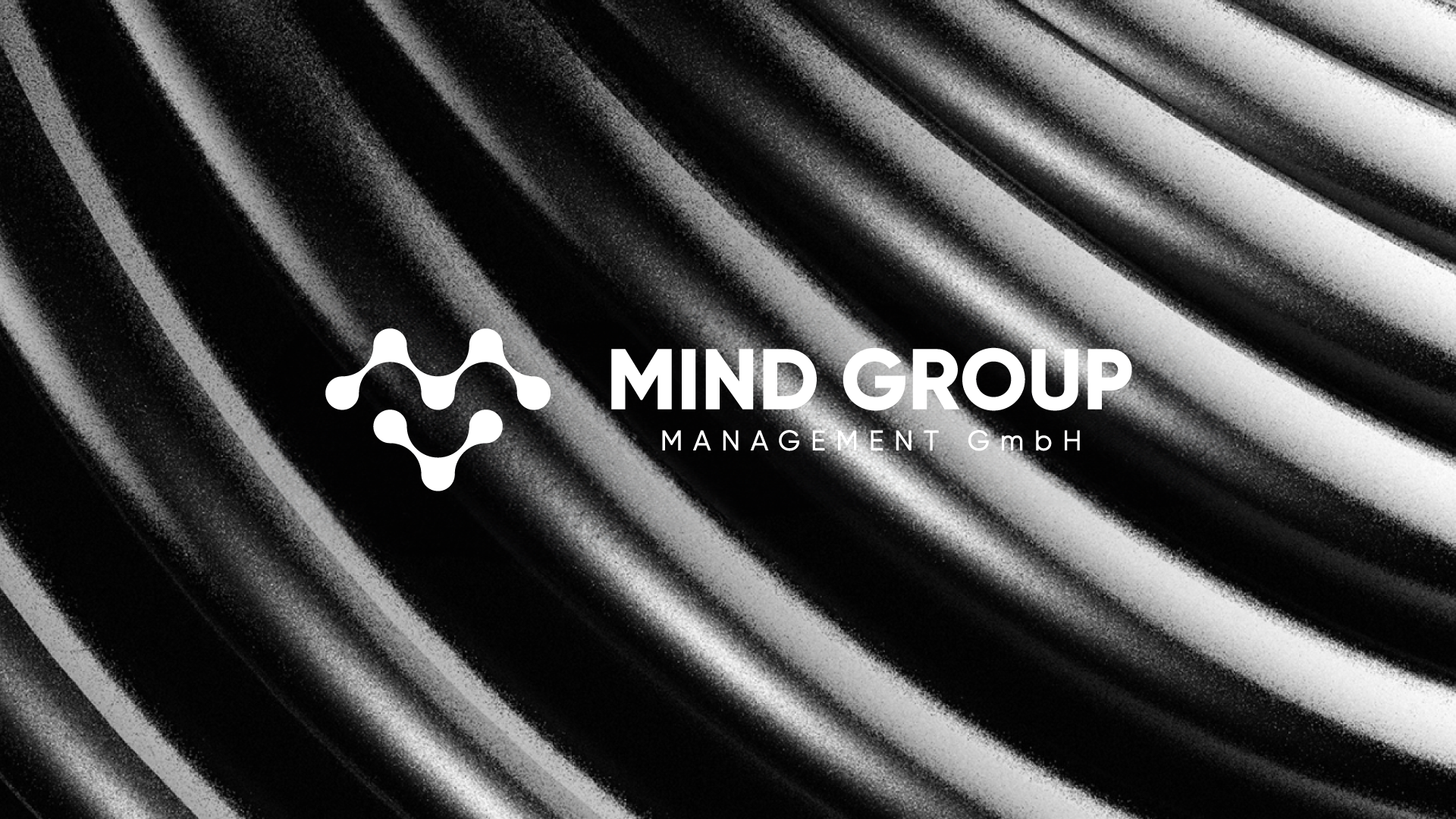
We are all MIND!
At Mind Group, the brand identity goes beyond just a name—it embodies the core values and mission. The Mind Group logo is a powerful visual representation that unites three essential elements that define who we are:
The M of Mind Group - The "connection M" symbolizing the strength and unity of the organization. The "M" stands not only for "Mind" but also for the foundation of the thinking and strategy "the collective intelligence".
People - The human element is central to everything we do. Clients and employees are at the heart of our vision, represented in the design to highlight their importance in the company. Mindgroup foster an environment where people can connect, collaborate, and thrive together.
Connections - Mindgroup believes in building strong relationships. The logo reflects the interconnectedness of ideas, people, and possibilities, signifying thei commitment to fostering meaningful collaborations both internally and with our clients.
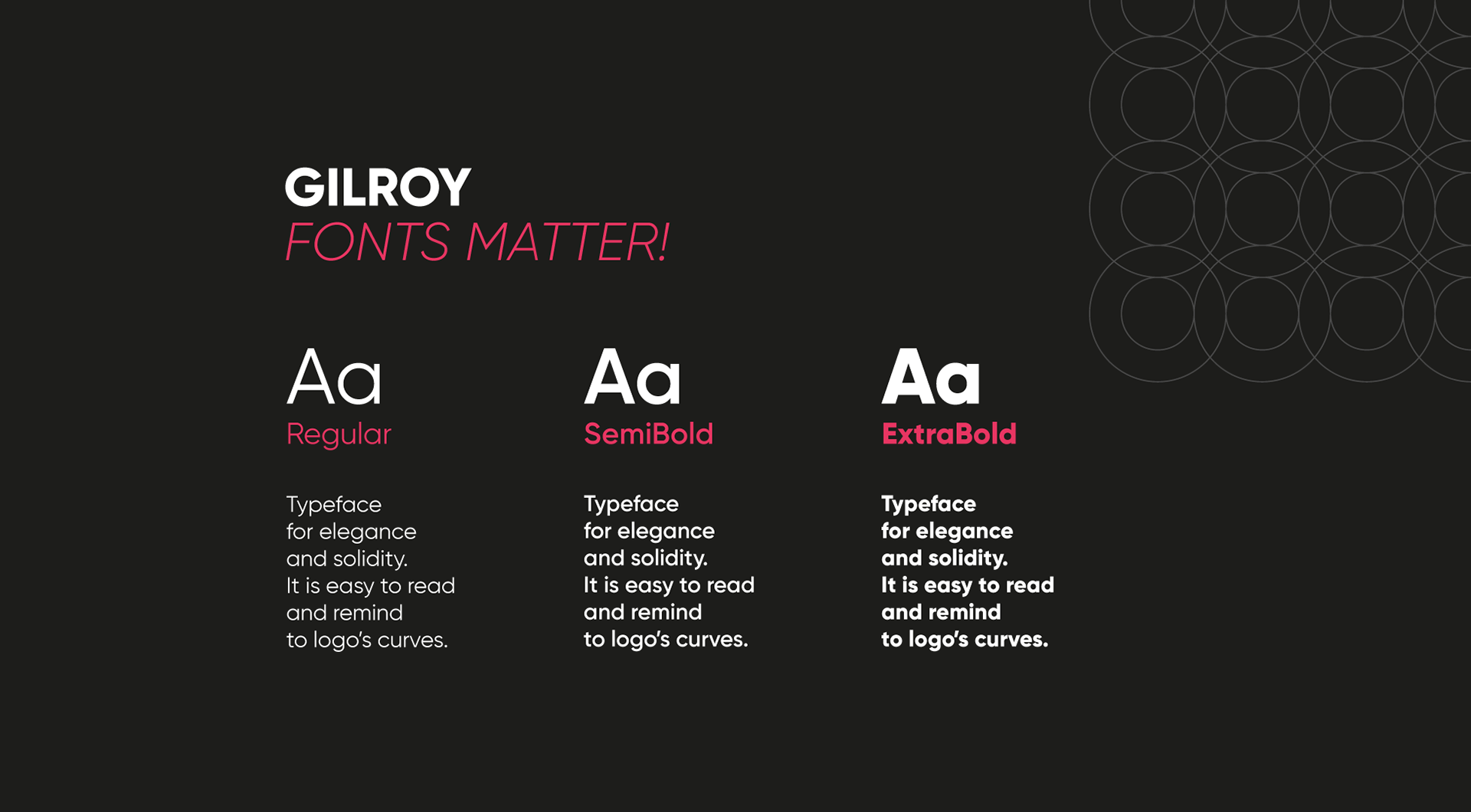
Typeface for Elegance and Solidity
The chosen typeface blends elegance with solidity, perfectly reflecting the values of our brand. Its clean, refined lines ensure easy readability while maintaining a strong, professional presence. The design subtly echoes the curves of our logo, creating visual harmony between the two elements. Just as the logo symbolizes connection and fluidity, the typeface extends these qualities through its smooth forms and balanced proportions. This combination of sophistication and clarity strengthens our brand identity, ensuring that our communication is both polished and accessible across all platforms.